


This commission piece is also from a friend's client, who has experienced various forms of renovations before but couldn't achieve the desired feeling and quality. This time, through the renovation of my friend's home, they learned about the personal touch of a freelance designer. After gaining a deeper understanding of the designer's approach to work and life, they decided to collaborate promptly. Both parties were committed to creating a masterpiece from design to completion. The final piece met expectations. As a designer, I am particularly grateful for the client's transparent mindset. A year-long collaboration, where everyone is happy, is important. Like attracts like, and it's all part of the arrangement to meet each other.
The owner lives with a family of three, with the male head often working from home, thus placing a high value on the living environment. This renovation is part of a home improvement process to enhance the quality of living. Environmental friendliness, durability, and aesthetic appeal are priorities. The owner has several "no-go" areas from previous renovations: - Hard装修 that follows current trends quickly becomes outdated. For instance, micro concrete floors are a no-go, as they crack easily and are not cost-effective. Areas that are frequently cleaned show different sheen and color compared to other parts. - No skirting design is practical for long-term living, and the level of detail is usually unacceptable for those with high standards. - No pure display-style open shelves; they become impractical once lived in. If one's taste is not up to par, the space quickly turns into a shelf. - Avoid simple curves and pure design elements. I've found that what was considered simple装修 now looks the same in every home. For this bathroom renovation, tiles are a must; the micro concrete bathroom has been a nightmare, so this time, we're not chasing any specific style.
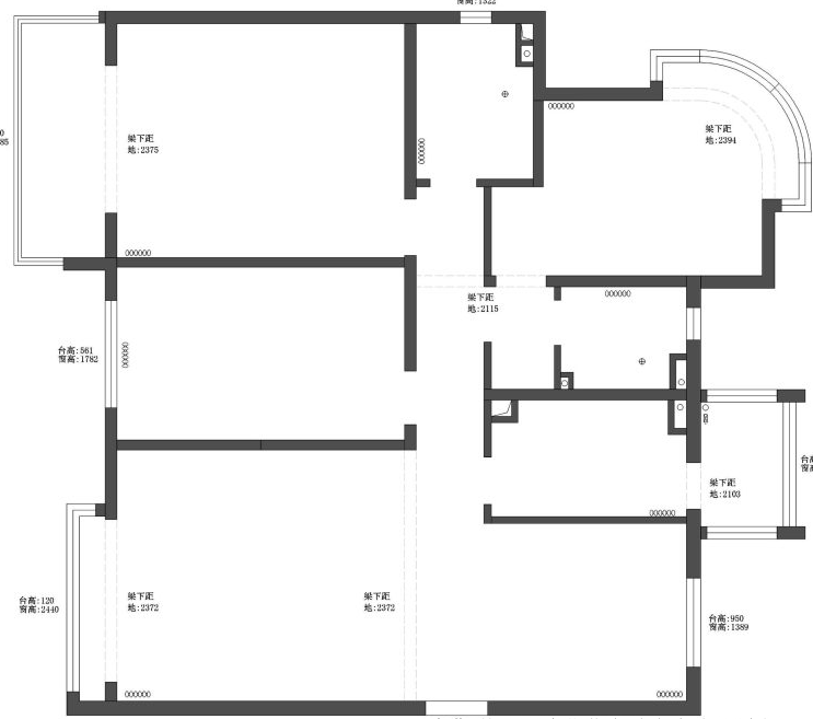
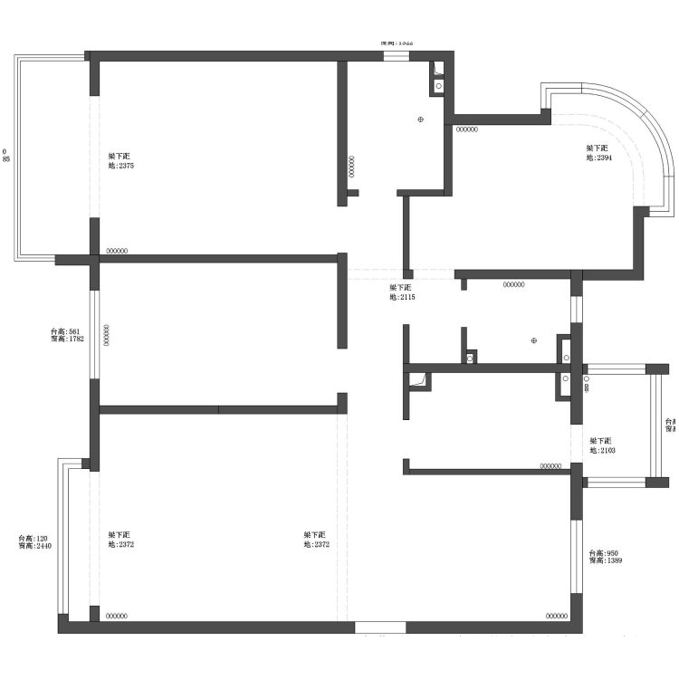
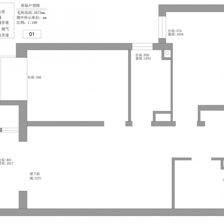
Original floor plan

Floor plan

Before entry design

Entrance效果图
Real-life Entry View
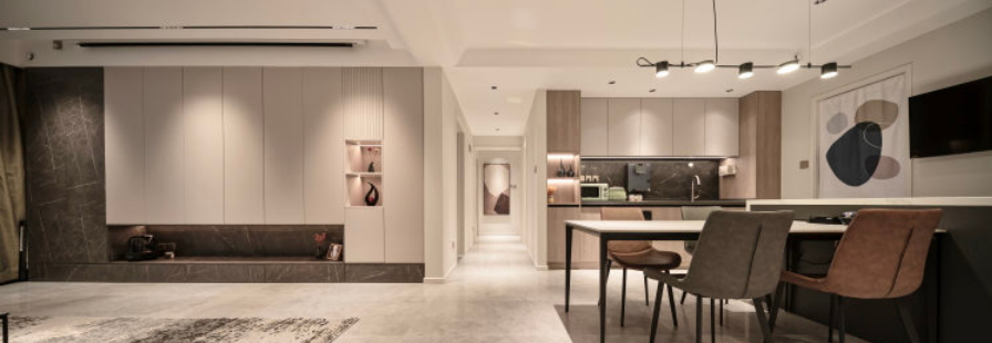
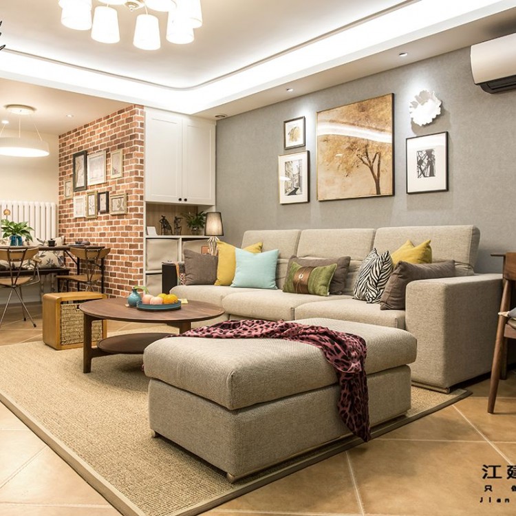
The entrance perspective offers a direct view of the living room and dining room in full. The newly planned living room, dining room, and kitchen spaces are seamlessly integrated in terms of color coordination, further expanding the spatial view. Functionally, the arrangement along the walls is tidy and provides storage without clutter. The soft furnishings create a subdued, slightly warm, and high-quality atmosphere. Lighting is subtle, with light but no visible lamps. The long-duration living location avoids glare points, where one can see light spots but does not accept them. The actual comfort experience is crucial here.
GuestHall rendering

Living Room Scene

We've omitted the so-called hallway partition design to ensure a comfortable and open space experience for family members on a daily basis, rather than compromising the overall layout for a single function. Designing requires prioritizing, with parts subordinate to the whole. The refrigerator must be an integrated design, with ample space for placing bags, changing shoes, and hanging clothes upon entering. The sofa area primarily focuses on a pure matching presentation, with functionality and habits kept straightforward, avoiding ambiguous boundaries. Carpets, decorative paintings, sofas, curtains, and decorative items play a decisive role in directing the overall space's tone. Missing any of them or mismatching them would detract from the sense of the space. Each is a carefully selected matching scheme by the designer.
Guest and dining room panoramic view
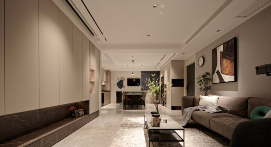
The dining and living room are primarily tiled in beige, 900.The 1800 view exudes elegance. Paired with gray-beige sofas and artwork, the addition of local greenery brings a refreshing touch to the entire space. The direct experience of seeing light but not the lamp is intuitive. The main theme is a simple match.
Before Kitchen Renovation

Before Renovation: The kitchen space prior to renovation was rather small, lacking in zoning, with a somewhat chaotic color scheme, making the dining area quite cramped as well.
Kitchen效果图

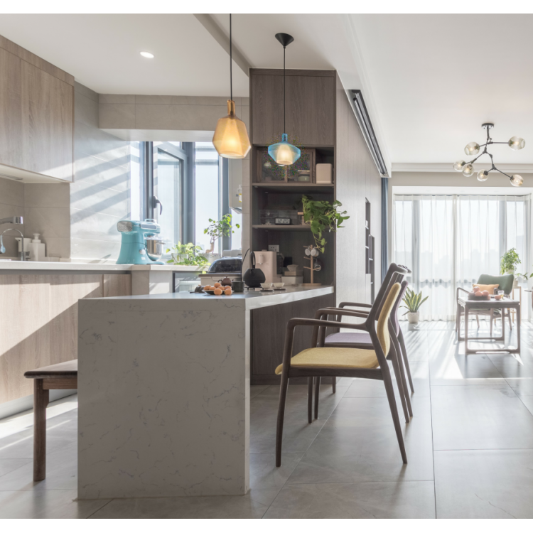
Transformed实景

I demolished the original kitchen walls, creating an open-concept dining-kitchen design, significantly expanding the sense of space. It "captures" the feeling of every square meter, generating numerous storage spaces. The multi-head pendant light above the dining table makes the restaurant space appear brighter and more transparent, enhancing the ambiance and instantly transforming it into a luxurious home.
Before Guest Room Renovation

Guest bedroom rendering

Guest bedroom actual photos
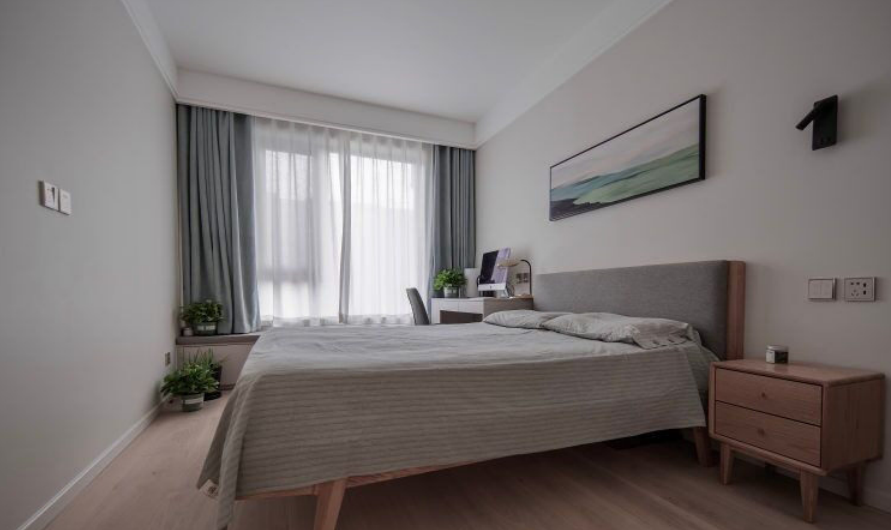
The renovated guest bedroom boasts a grand design that maintains the bedroom as a functional space for rest. A few pots of greenery by the bed, blue-gray curtains, and comfortable bedding exude a sense of comfort and tranquility.
Before Secondary Bathroom Renovation

Before Renovation: The secondary bathroom had a chaotic layout of wall tiles, and the clutter of the toilet and washing machine made the space feel very cramped.
Second bathroom rendering
Second toilet scene


The renovated secondary bathroom features a wet and dry separation, with the washing machine and dryer designed as built-in units. Some space from the study was utilized, with the mirror cabinet illuminated by a light strip to broaden the view, and the sink and storage cabinet designs offer a sense of depth.
Second bedroom rendering

Second bedroom actual view

The second bedroom has a more colorful space, perfectly suited for a child's room, exuding a harmonious yet playful atmosphere.
Before Master Bathroom Renovation
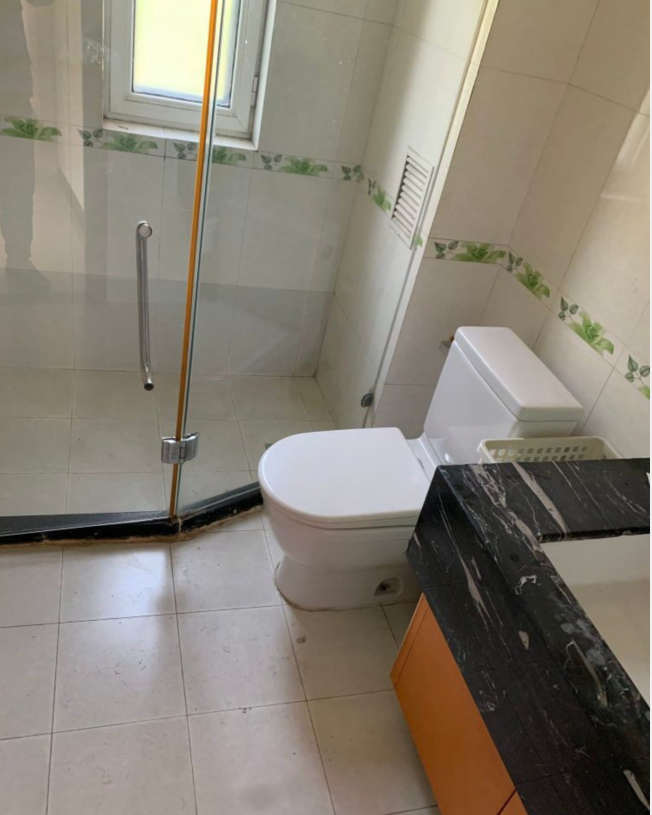
Before Renovation: The master bathroom has a dry/wet separation, but the color scheme is not harmonious. The toilet area is relatively cramped, and the main entrance door directly faces the master bathroom door. It feels quite unpleasant.
Master Bathroom View

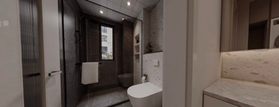
After renovation, the master bathroom door avoids the entrance door. The storage cabinet below the master bathroom sink offers both robust storage and easy access, with items neatly organized in layers. The gray shower and frame accents create a minimalist and luxurious aesthetic. The bathroom focuses on functionality, storage, comfort, and ease of maintenance. The tile market changes rapidly, so the designer specifically chose simple textures and occasional combinations to create the bathroom.
Master bedroom renovation before
Master bedroom rendering

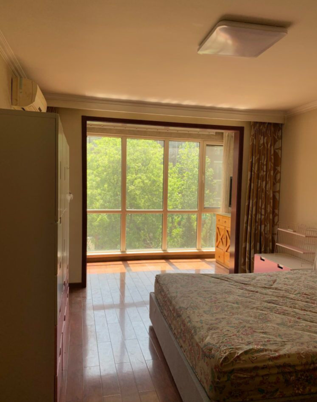
Master bedroom actual scene

The gray tones and translucent earthy hues, combined with simple lines, create a comfortable master bedroom space. The mix of materials like wood and fabric not only embodies the charm of nature but also enhances the space's elegant and distinctive character. The split-color wall design of the headboard adds depth to the background. A home may not be spacious, but creative design can always "paint the picture" beautifully, making the home comfortable, cozy, and delightful, fulfilling all the owner's expectations for a comfortable home.