
This project was photographed six months after occupancy. It authentically showcases practicalist home decor art. It accommodates three residents: parents and their son, with the elders occasionally staying over. For medium to large-sized homes, it's essential to highlight the spacious aspect while fulfilling functional needs. The originally enclosed kitchen has been opened up. The relatively enclosed guest bathroom wash area has been opened. The previously enclosed study space has been opened, with sliding doors added for a sense of openness and increased lighting, while maintaining a degree of privacy. No detail is overlooked to enhance the feeling of space or to introduce more light. The materials used are environmentally friendly with a matte finish and quality texture. The color scheme is a warm, muted gray with accent pieces featuring distinctive furniture and decorations. It creates a comfortable, harmonious, and fun living atmosphere.
Floor Plan
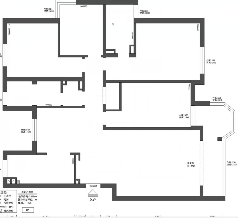
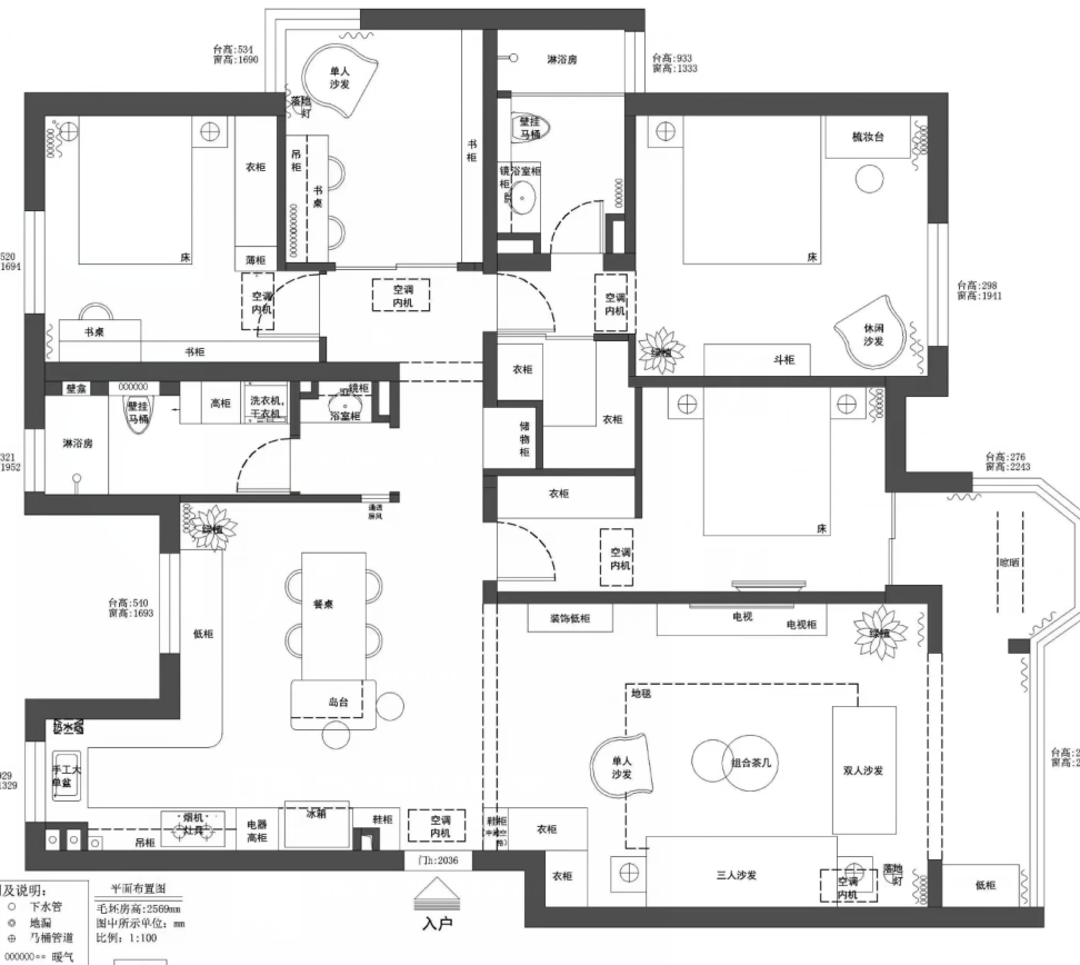
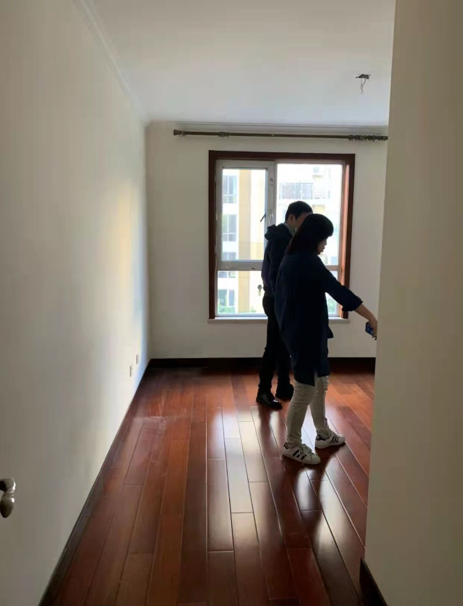
The original structure of the case featured narrow hallways between the living and dining areas, with the kitchen lacking ample storage space. After placing the dining table and chairs, the hallway was already too narrow for comfortable movement. The guest bedroom hallway cabinet was not utilized efficiently, resulting in wasted space. The master bedroom was short on storage, and the hallway between the master bedroom, study, and second bedroom was somewhat elongated, not making the most of the long passageway for functional planning or to enhance spatial perception. The bathroom area was also disorganized, causing interference during use. The designer chose to maintain the openness of the space upon entering, opting not to install a screen or what is commonly referred to as a foyer. Instead, various storage functions were arranged along the walls, keeping the area as open as possible, which is actually very effective in small apartments. The guest bathroom dry area did not have the partition wall removed but was partially hollowed out, ensuring openness while preserving privacy. The sink area was relatively cluttered during normal use, but this approach preserved the integrity of the main space's effect. The wall between the study and the hallway was removed to increase the sense of space. To ensure the master bedroom's spaciousness, the master bedroom's wardrobe area borrowed some space from the guest bedroom. This approach made full use of the户型 island area, making it usable in all directions, resulting in a very high space utilization rate. It also allowed the side of the bed to be freed from the traditional wardrobe layout. In the bathroom area, separation was made where possible, and standing options were utilized.
Before Lobby Design
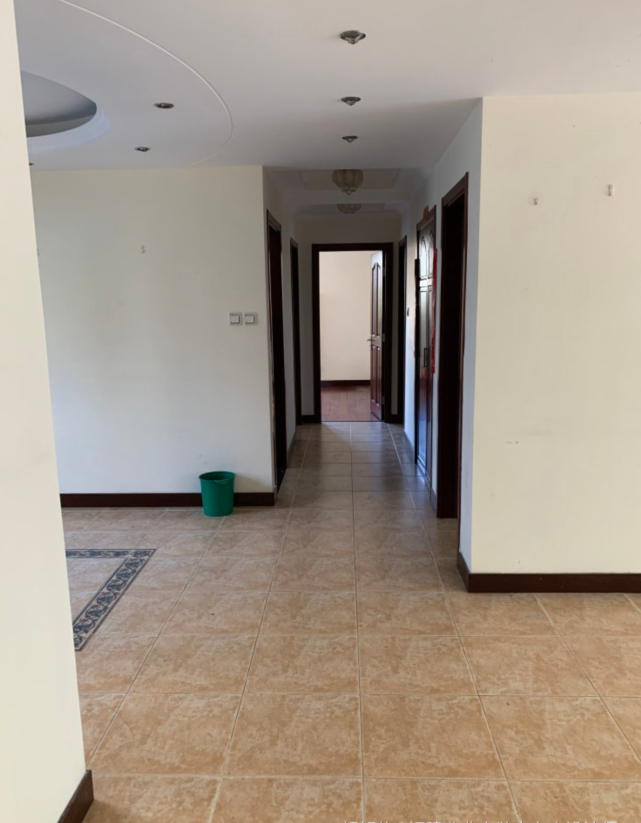
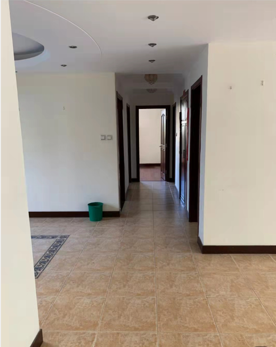
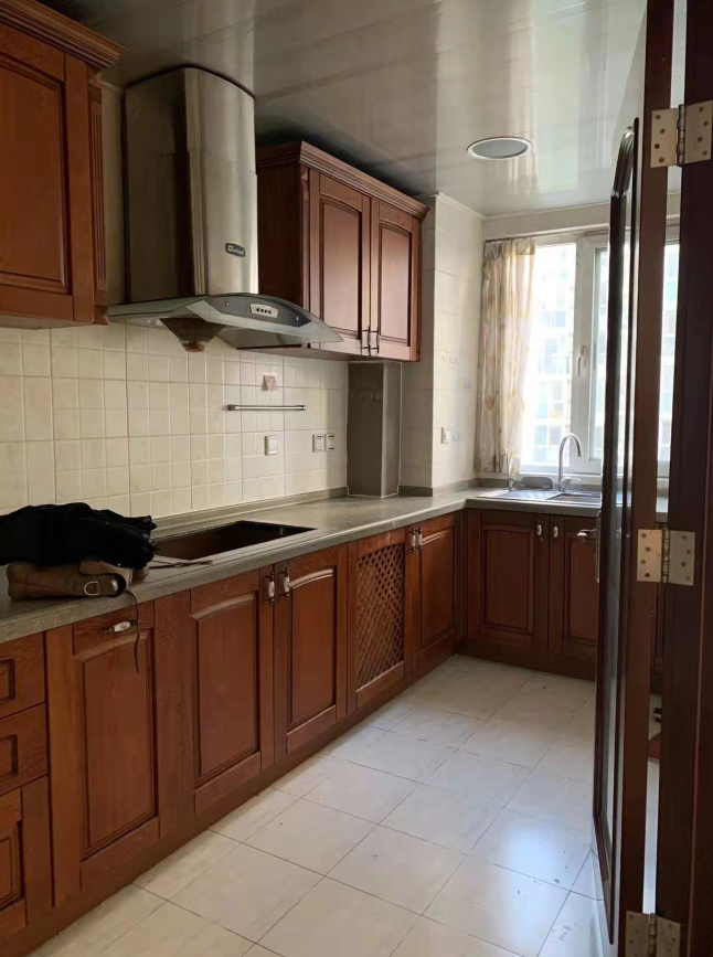
The original entryway space was disorganized, with the kitchen standing separately from the dining and living areas, resulting in a small sense of space and poor interaction.
Entrance hall rendering
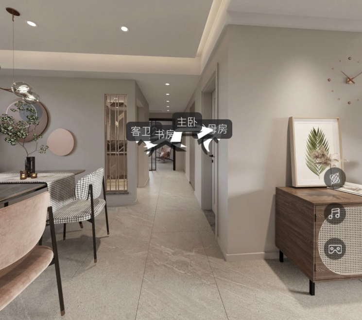
Entranceway scene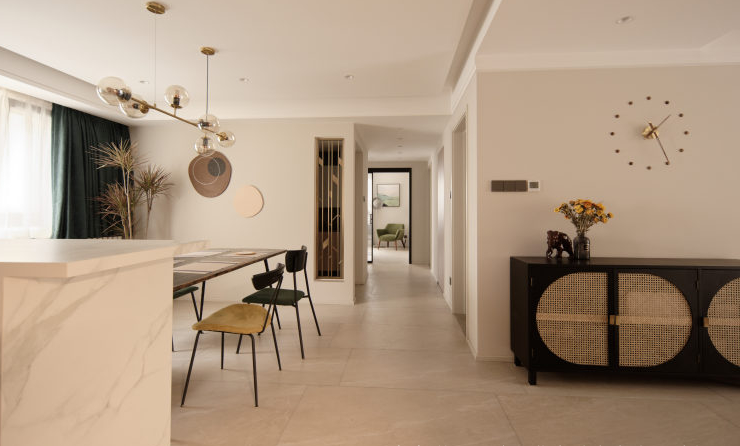
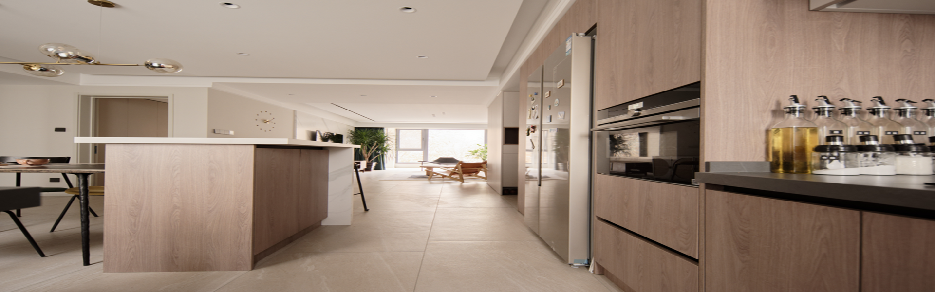
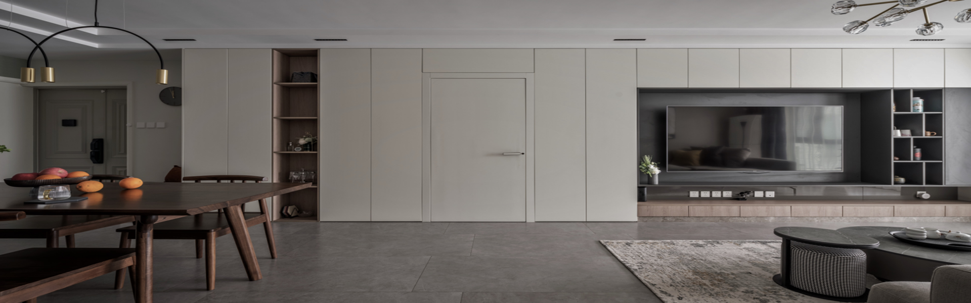
Open the kitchen, storage features run along the wall. Enjoy a spacious open area. Extend the significance of the foyer to the background decoration of the study. In choosing the entryway space, prioritize either vertical storage or openness, while satisfying the storage needs. Here, we opt for space dominance.
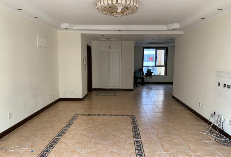
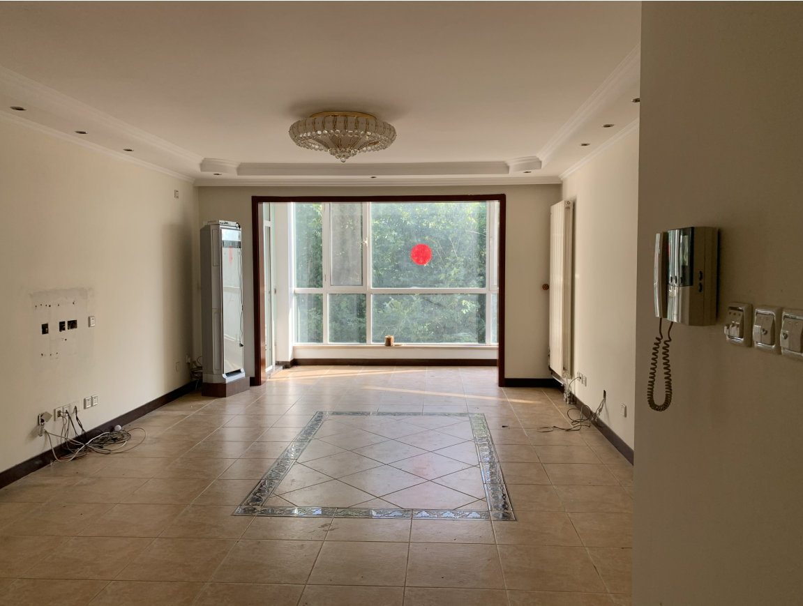
Before Living Room Design
Living Room Elevation View
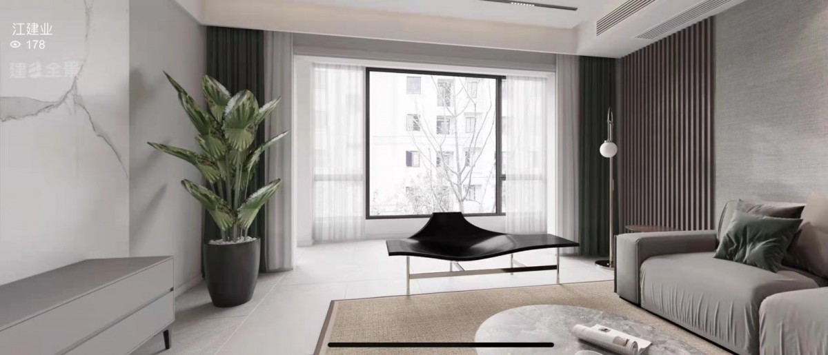
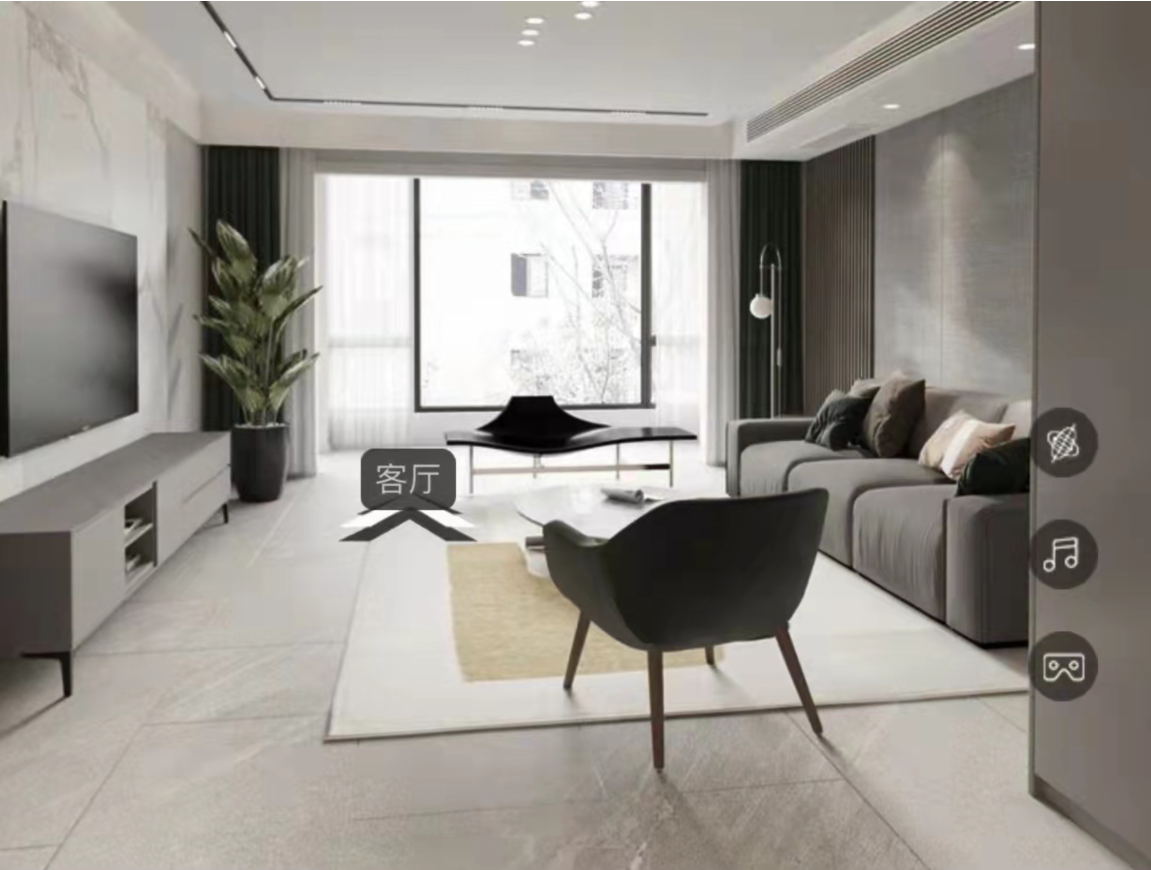
Living Room Scene
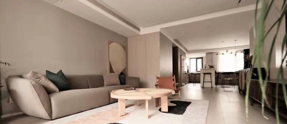
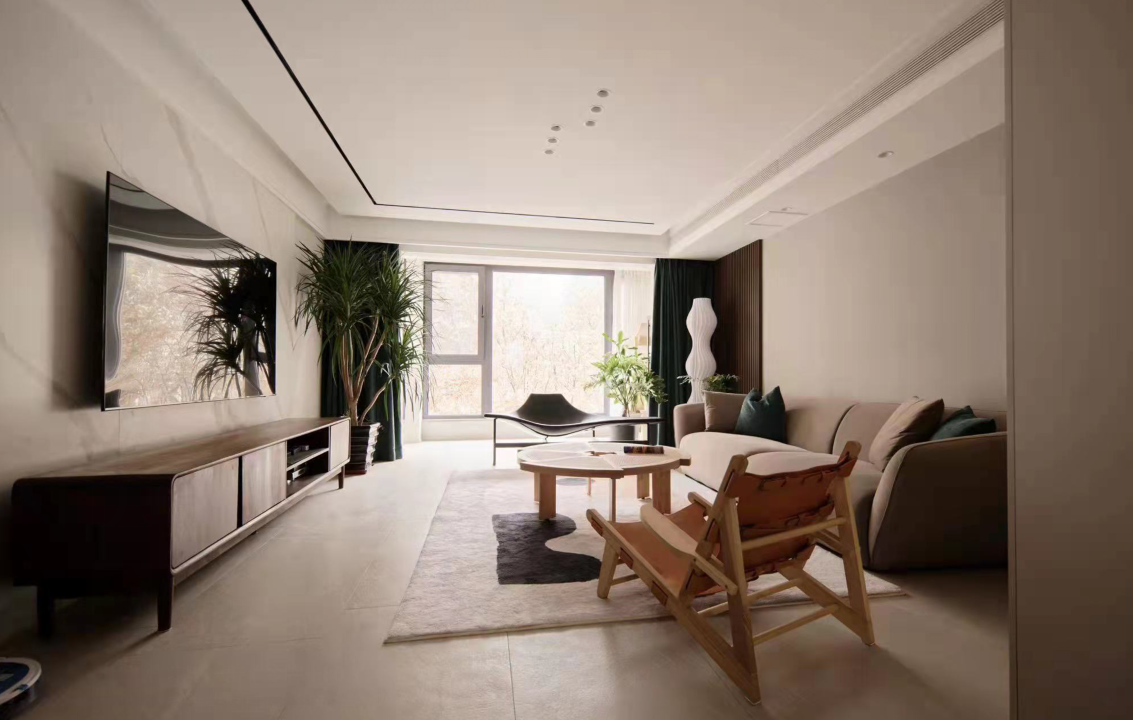
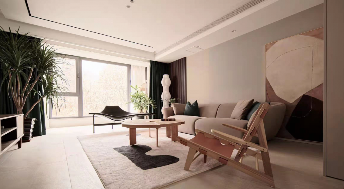
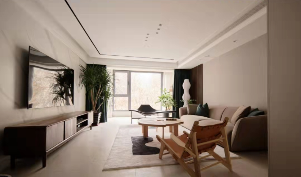
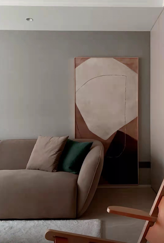
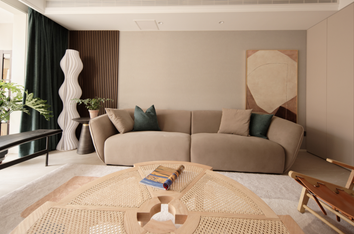
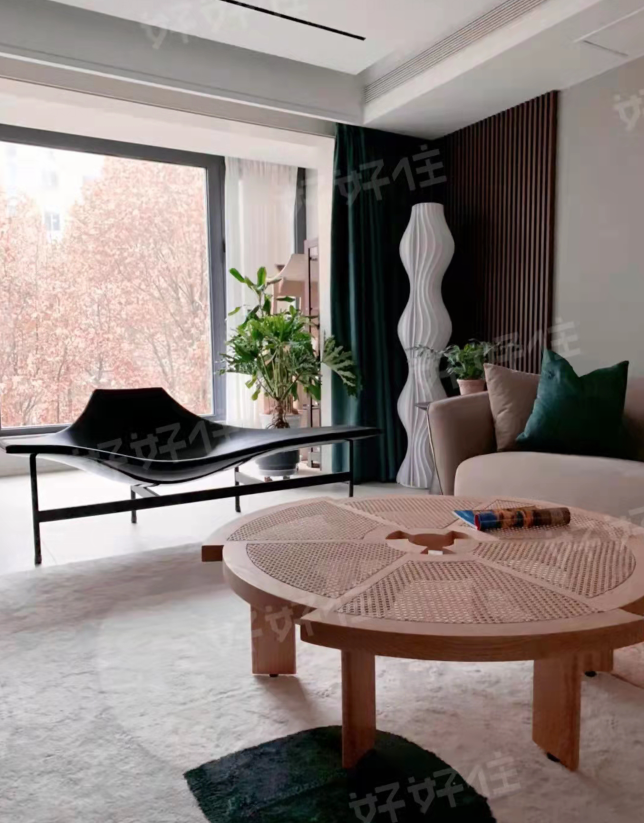

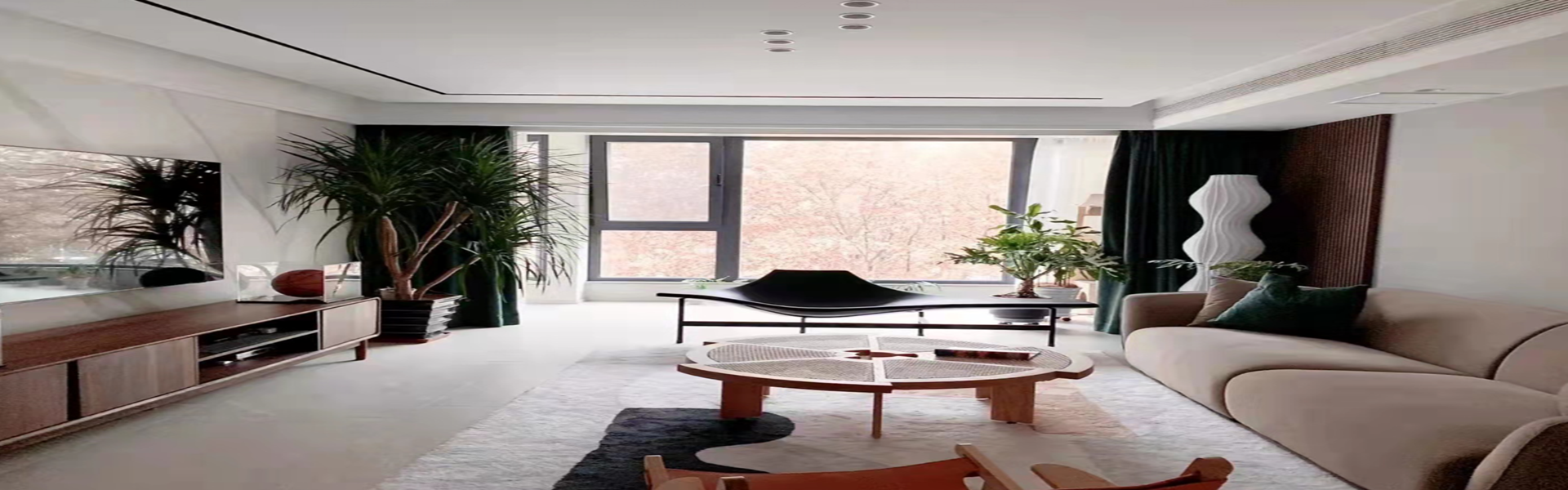
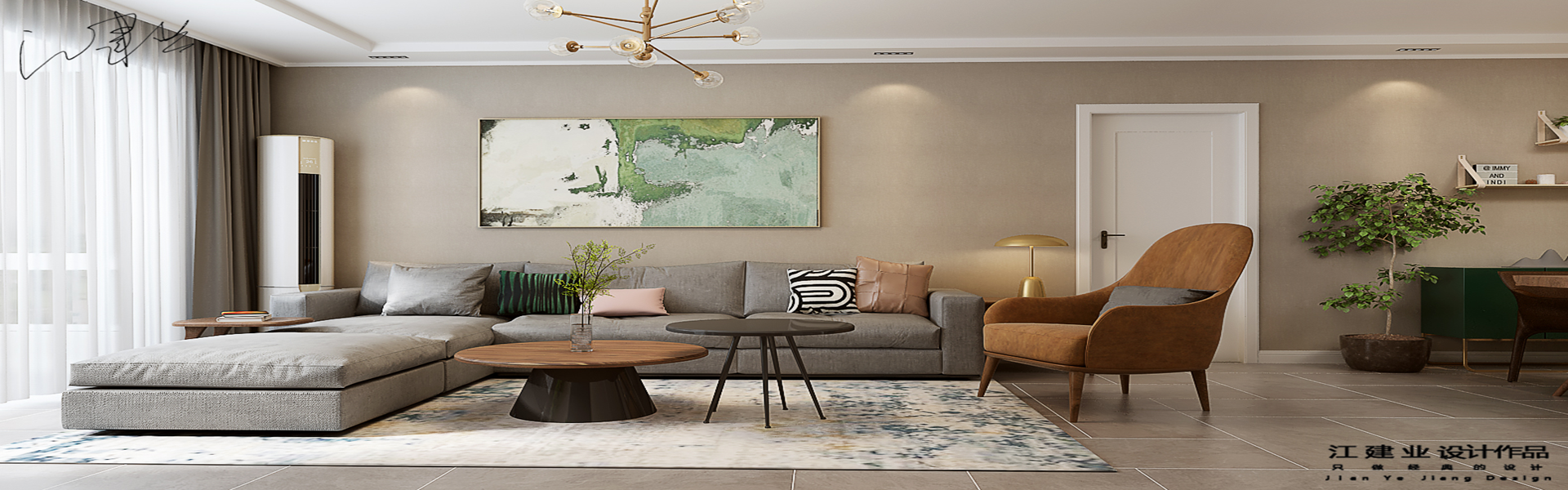
The previously fragmented windows in the living room have been transformed to create a complete and spacious design with unobstructed views. The openness between the living, dining, and kitchen areas greatly enhances the comfort and interaction of the户型. Materials are all chosen from the matte series for an eco-friendly touch. The environment is designed to be soft and relaxing, with a hint of leisure. Under the calming ambiance of earthy tones,局部 bright colors add vitality and fun to the space.
Before Restaurant Design
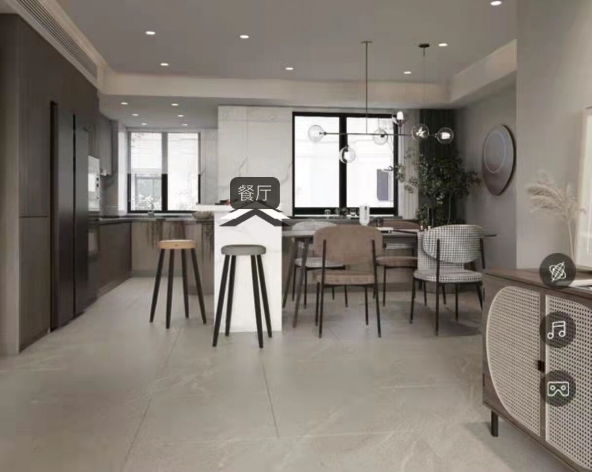
Restaurant rendering
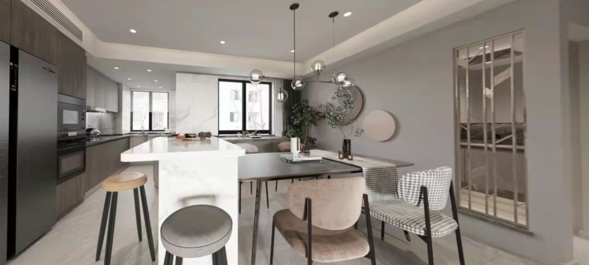
Restaurant Setting
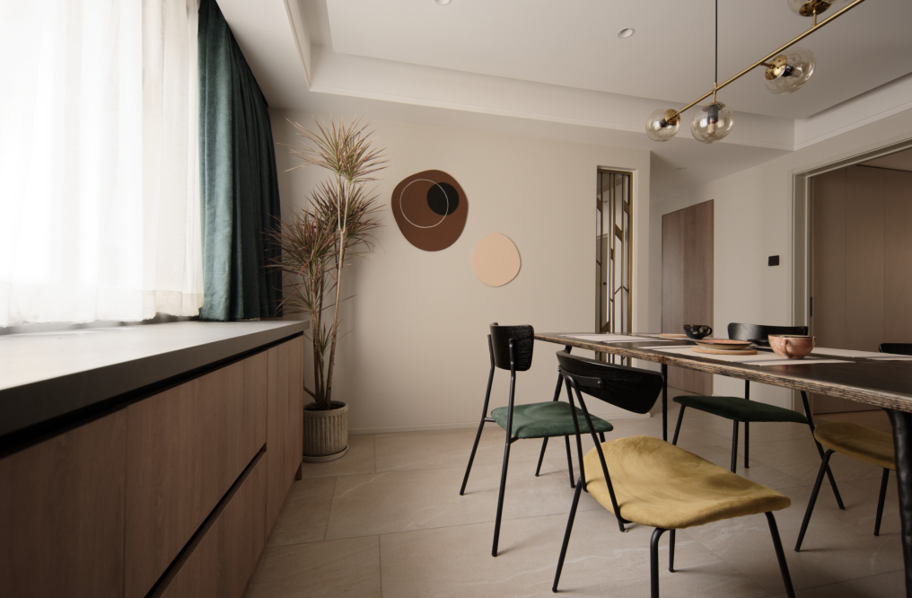
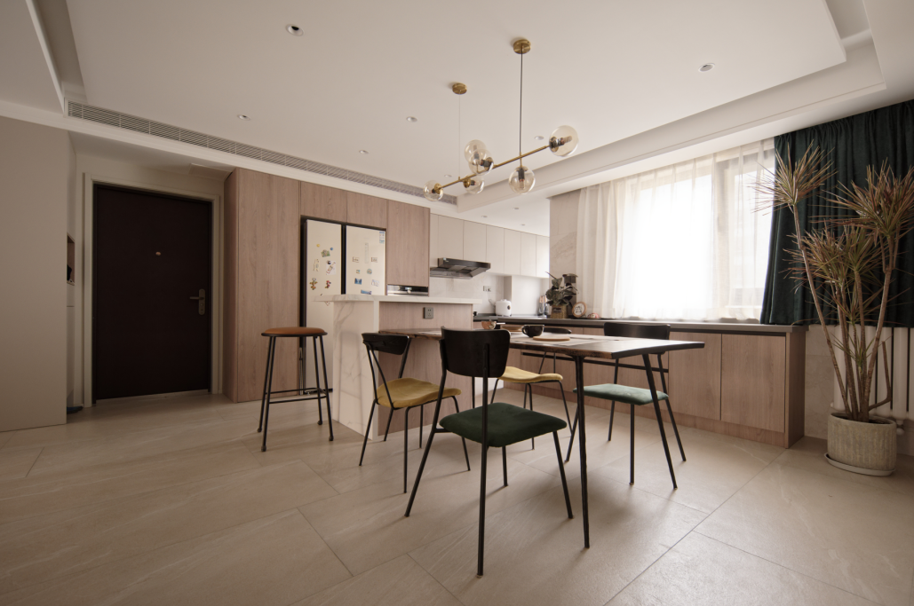
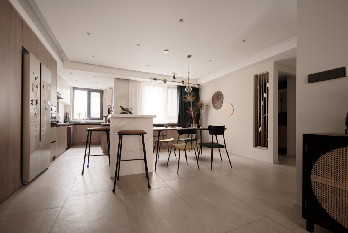

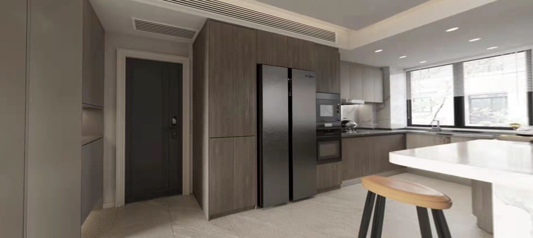
The dining and kitchen area has undergone visible transformations. The island and large dining table setup was unimaginable in the previous space. Storage capacity has significantly increased. Standing in the kitchen and looking into the living room, the spacious depth showcases the house's character. Instead of removing the wall of the bathroom washroom, a hole was created, and a transparent partition was designed, maintaining privacy and cleanliness while expanding the sense of openness.
No Chinese content provided.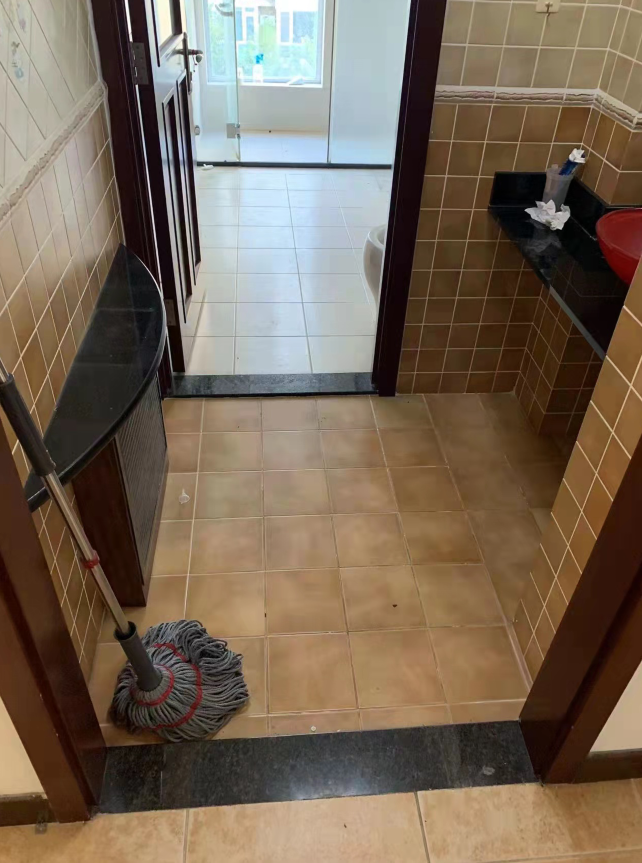
NextGen Sanitaryware Elevation Rendering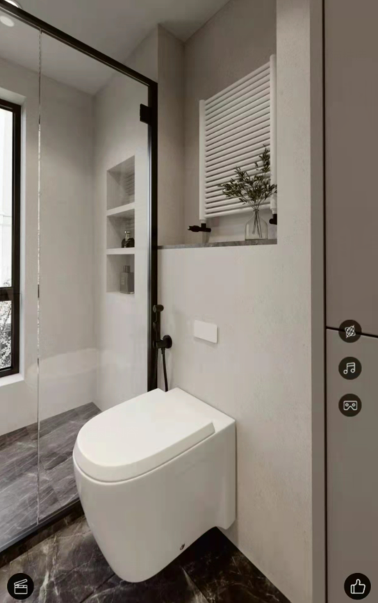
No Chinese content provided.
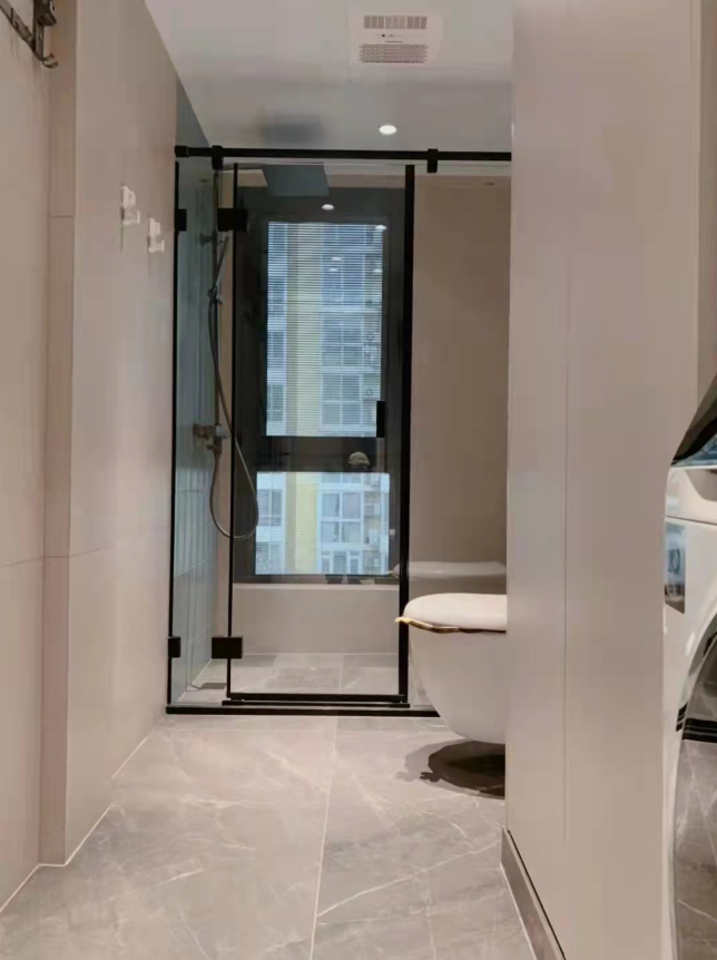
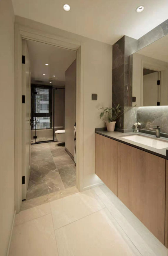
Guest bathrooms retain the exterior washbasin design for convenience, allowing for seamless interaction between the inside and outside spaces. The dryer function of the washing machine can be placed in the standing space when needed, with the noise and duration of the dryer being minimized to not disrupt the public area's living experience. Tiles are installed using large-size tiles, applied thinly for a simple and elegant look. The medicine cabinet ensures the cleanliness of the bathroom cabinet area. There is basically no failure in the transition from before to after occupancy. The high cabinet next to the washing machine houses various equipment and a laundry basket, all designed to ensure functionality. A preference for matte tiles has always been maintained. The main color scheme is plain with occasional textures or colors for accents. Internal blinds are used for the windows, although there is a relatively low risk of failure, they were chosen to enhance the living experience.
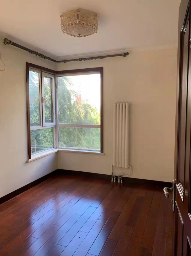
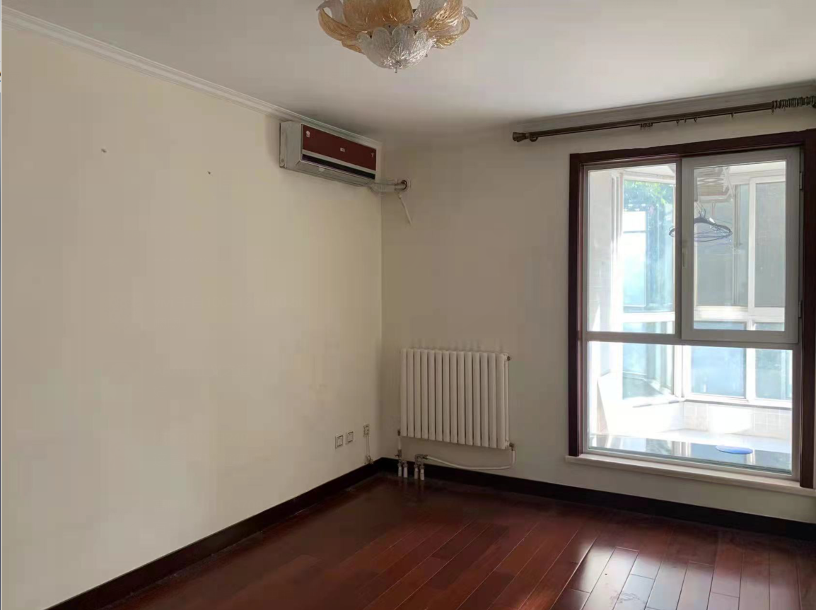
Before the guest room design
Second bedroom rendering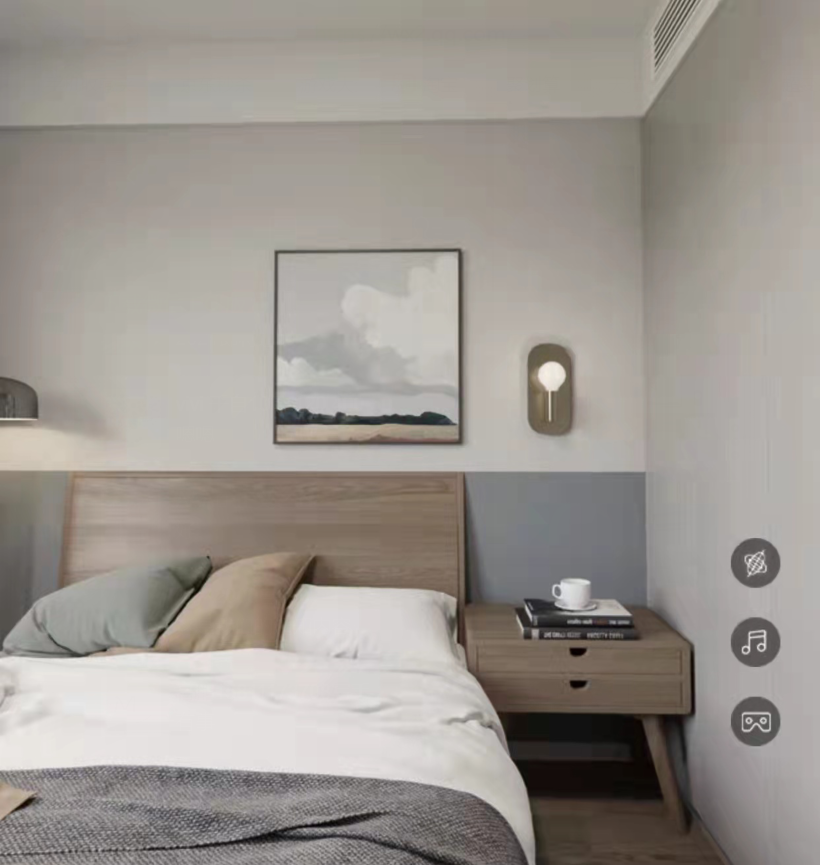
Second bedroom in real life

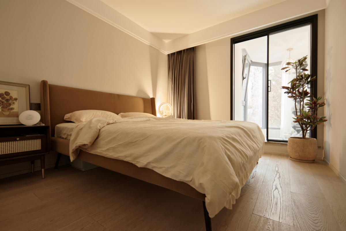
Son's bedroom, brimming with Morandi, fills life with emotion.
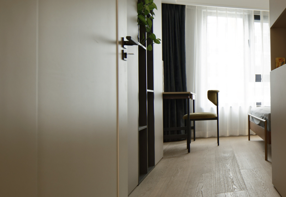
Before Study Room Design
Office Study Aesthetic Rendering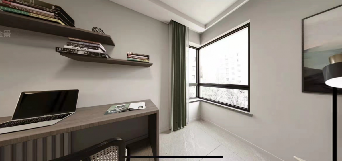
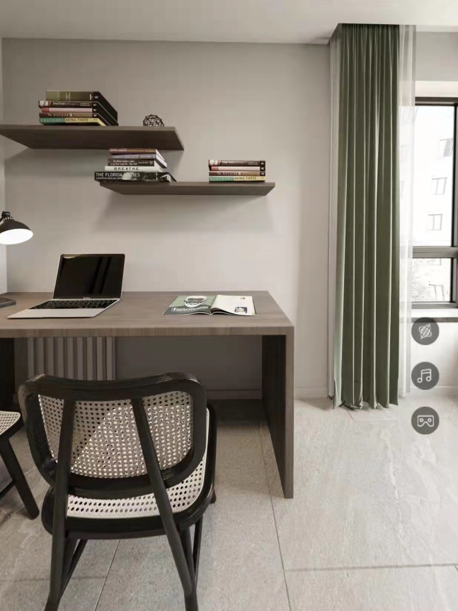
Study room scene
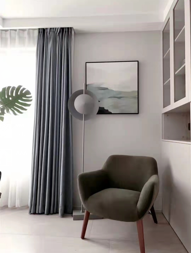
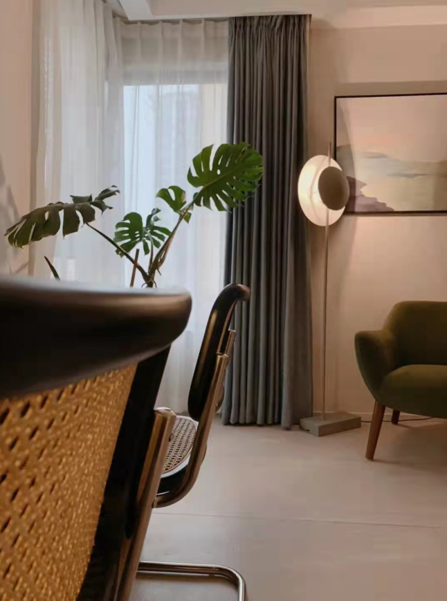
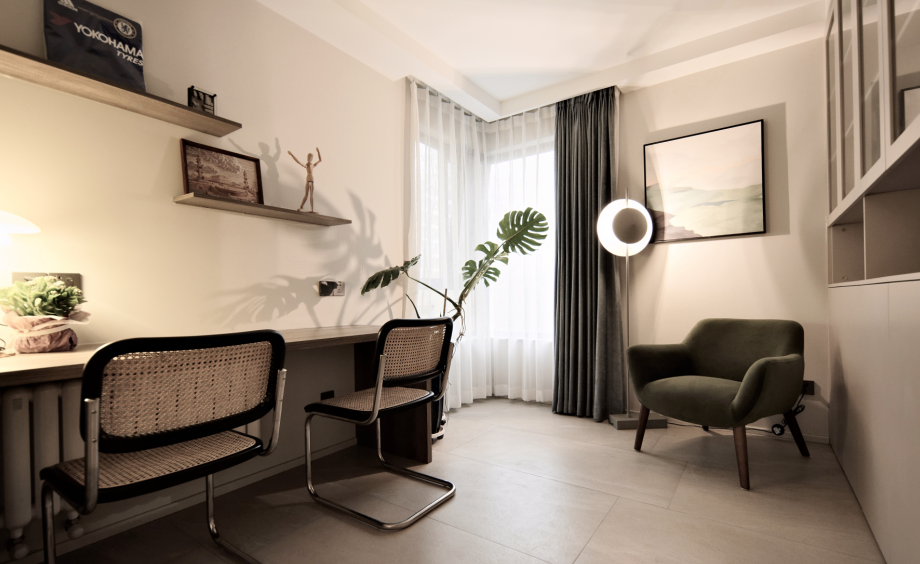
The study space is arranged with a double desk and a leisure reading nook. Greenery creates a relaxing atmosphere. Packed with ambiance.
Before guest bedroom design
Guest bedroom photo
The guest bedroom is a space that enhances ambiance, with Zen-inspired branch-style table lamps instantly boosting the room's aesthetic appeal. Instead of excessive decoration, the small space is kept minimalist, allowing for a sense of extension and avoiding a cramped feel.
Pre-Master Bathroom Design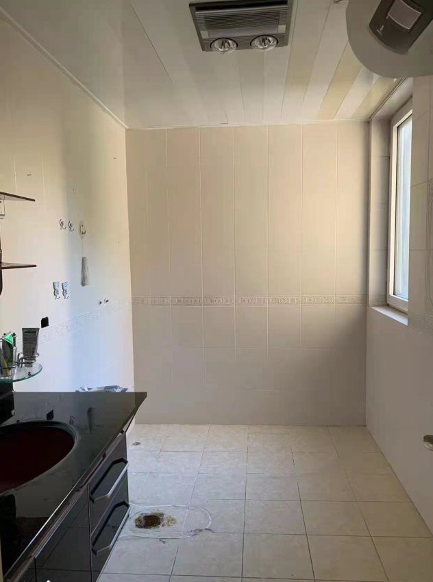
Master Bathroom Scene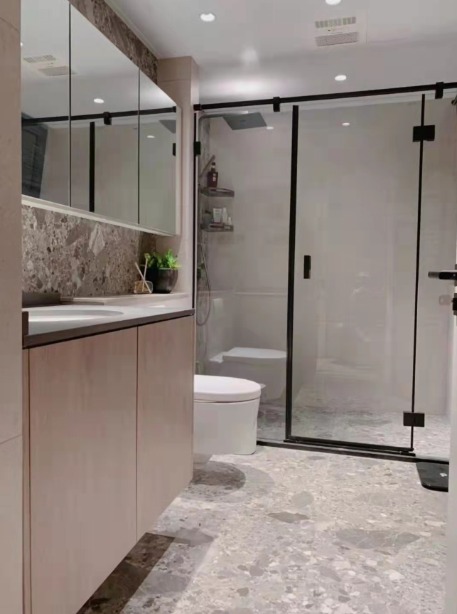
The master bathroom incorporates matching colored mosaic tiles into the gray palette, complemented by a bathroom cabinet in a slightly off-gray wood tone. The overall ambiance creates a serene and upscale bathroom atmosphere.
Before Master Bedroom Design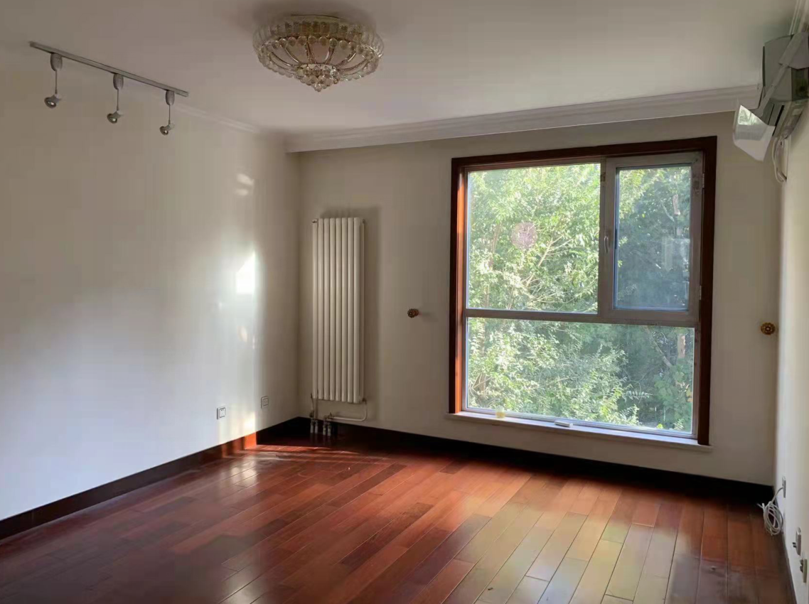
Master bedroom rendering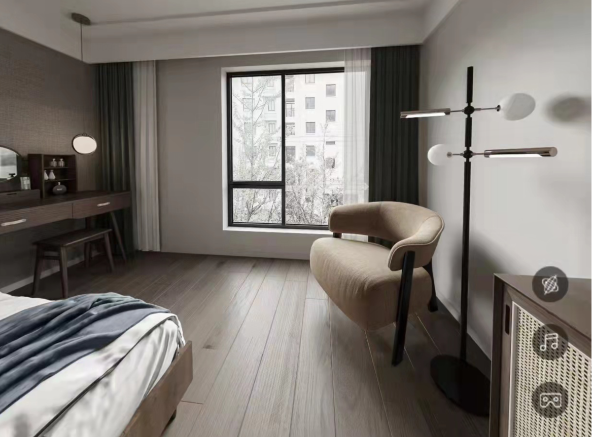
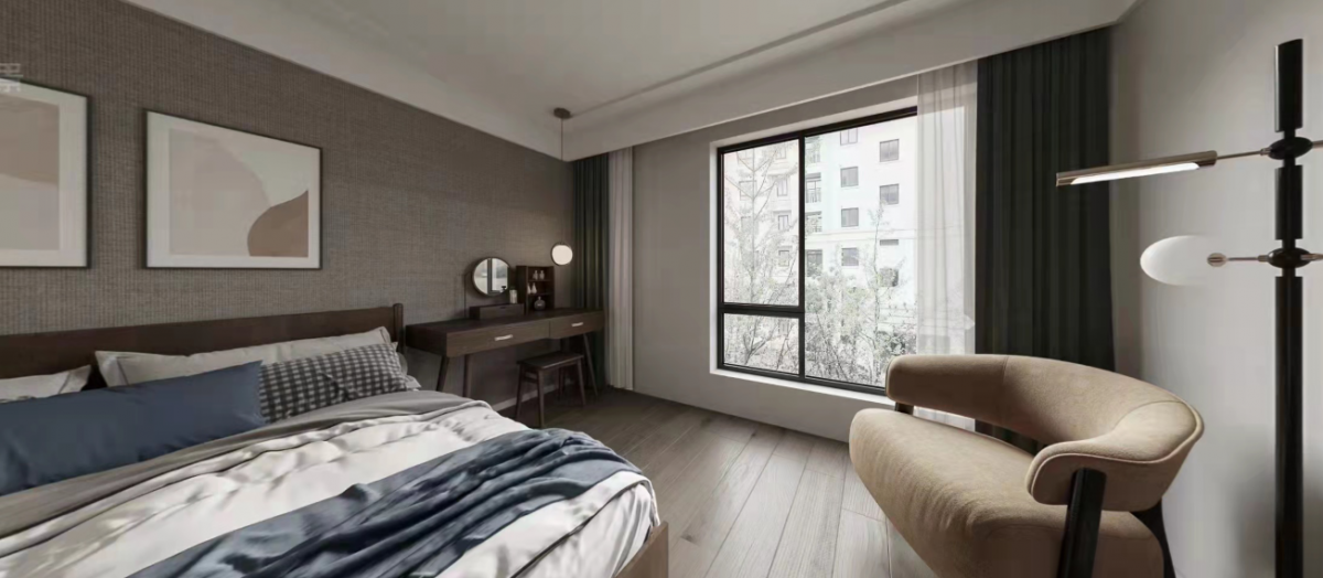
Master Bedroom Scene
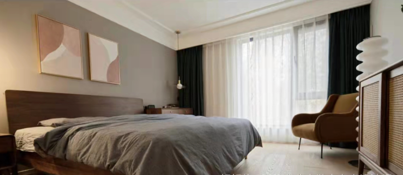
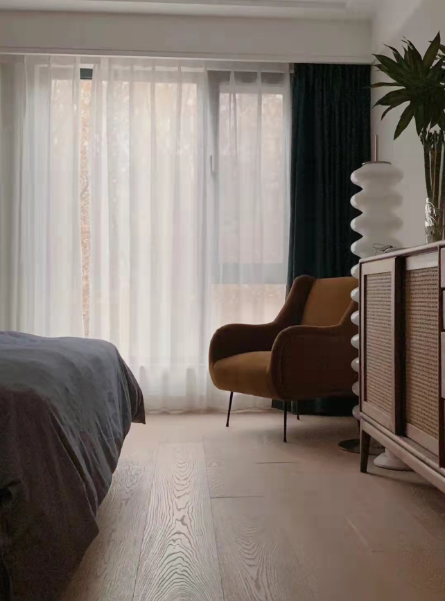
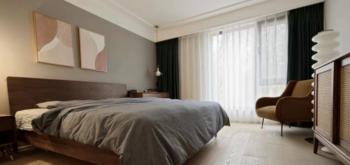
The master bedroom's space design utilizes the guest bedroom to create a walk-in closet, ensuring the master bedroom remains neat and grand. Lighting continues with the traditional two-mode design, offering both bright and ambient lighting options.
